TikTok’s parent ByteDance eyes a new chapter, in book publishing

After aggressively promoting its new lifestyle social media platform Lemon8 in the U.S., ByteDance appears to be brewing another content app for its biggest overseas market.

Lemon Inc, a subsidiary of ByteDance, has submitted a trademark application for a range of book publishing products and services, according to a filing posted on the United States Patent and Trademark Office (USPTO). The trademark, which is called “8TH NOTE PRESS,” offers an interesting glimpse into ByteDance’s apparent e-publishing ambitions.

The trademark filing was earlier reported by Business Insider.

The list of products and services registered with 8TH NOTE PRESS includes an app to read, download and discuss fiction ebooks in an online community; retail bookstore services; ordering books in audio, printed and digital formats; publishing ebooks, audiobooks and physical books; as well as providing online, non-downloadable fiction and non-fiction books.

Corporations register trademarks all the time in anticipation of expansion into new verticals in the future, but they don’t specify timelines or hold the registrants to any obligations, so the move to trademark 8TH NOTE PRESS doesn’t necessarily mean ByteDance is taking any material steps into the publishing world yet.

But book publishing and distribution do sound like logical next steps for ByteDance given TikTok’s success in attracting book lovers to share under the #BookTok hashtag on the short video platform. Though ByteDance posted a record profit last year as a whole, TikTok itself suffered widening losses, the Financial Times reported. ByteDance is likely eager to find new ways to monetize its hundreds of millions of users overseas.

The trademarking effort is “not related to TikTok” but ByteDance is “always exploring new opportunities,” according to a person with knowledge of the matter. That’s expected given the bite-size nature of short videos doesn’t square with long-form reads that require a longer attention span.

TechCrunch has reached out to ByteDance for comment.

It won’t be surprising to see ByteDance rolling out a standalone book app where users can, as the trademark registration suggests, read, download, buy and talk about books.

While TikTok might not be directly distributing books, it can certainly help drive users towards the potential book app — as it has done for Lemon8 by recruiting influencers to promote the lifestyle-focused social media platform.

The mountain of user data and insight that TikTok has accumulated could be used to figure out what people like to read, and the same kinds of content recommendation algorithms that suggest videos on TikTok could be used to introduce new books to read on a separate app.

If ByteDance does wade into e-publishing, the question is how it plans to compete with the industry’s giant, Amazon, on publishing and distributing books. And where it would fit into what has shaped up otherwise to be a pretty fragmented market in the long tail.

There are scant data on online publishing and Amazon has never revealed much about the operation’s revenues and in cases when it does, it’s famously vague about these metrics. It’s also an insurmountable task to track all the books self-published through Kindle not least because not all of them have their international identifiers, or ISBN numbers, as research group Wordsrated points out.

Amazon’s position as a popular publisher, distributor and hardware player (via the Kindle), however, likely gives it an outsized place in that market. Industry pundit Benedict Evans estimated at the end of 2019 that Amazon had “50% or more of the U.S. print book market, and at least three quarters of publishers’ ebook sales.”

ByteDance’s edge in books clearly lies in its sprawling social media empire where authors and fans can connect directly and readers can share their thoughts with others.

That role is, effectively, still up for grabs. The closest that Amazon has come to fostering an online community for its readers is the acquisition of the social reading site GoodReads a decade ago.

The integration of GoodReads with other Amazon properties has been limited at best, with WiFi-connected Kindle readers occasionally seeing GoodReads highlights and GoodReads making Kindle the default purchase option. But the 16-year-old book review site seems to be still going strong with 125 million “members” and 3.5 billion books cataloged, according to the company.

ByteDance is no stranger to e-books. In 2020, news came that it would acquire roughly 11% of the publicly-traded Chinese e-book reader Yuewen (the deal went through). It also operates one of China’s most popular web novel apps, Tomato Novel, letting readers read for free but with ads or have them pay a monthly subscription fee for an ad-free experience. In 2021, it dabbled in running an English web fiction app called Mytopia that spanned the romance, horror and fantasy genres. It doled out rewards to attract novel writers, not unlike its giving cash incentives to TikTok creators.

Before Mytopia had a chance to grow meaningfully, it caught flak for launching erotica ads on Facebook and Instagram. 8TH NOTE PRESS should know better this time around.

TikTok’s parent ByteDance eyes a new chapter, in book publishing by Rita Liao originally published on TechCrunch

Review: Kobo’s Sage and Libra 2 e-readers improve displays but compromise on design

The latest pair of e-readers from Kobo provide a modest but noticeable upgrade to the display, stylus support, and Bluetooth for listening to audiobooks, but take a step down in build quality from the admirable Forma. But the new capabilities may be worth the upgrade, and the Libra 2 especially makes for an attractive little package.

The devices are successors to the Forma and Libra H2O, the forma of which (forgive me) has been my daily driver since I cracked the screen of my beloved Boox Poke 3. The main differences between the two new readers is size; most of the other features are the same. At $260 and $180 the Sage and Libra 2 aren’t cheap, though I think that least the latter is worth considering if you use an e-reader regularly, and like audiobooks and Pocket.

The most visible new feature is the screen, which is the latest Carta 1200 E Ink display. Both readers have 300 PPI, which is more than enough to make the text look sharp. Comparing the older Forma to the Sage (as they have very similar builds) I was surprised to find that the new screen really does make a difference; the contrast is noticeably improved and the Forma’s letters seemed slightly grey next to the much darker Sage’s. Both look excellent, to be clear, but the new screen is an improvement.

Operation is much the same as previous devices, though the upgraded internals mean these are a bit quicker to wake, navigate, and reorientate when you flip them. Once in a book, page turns took about the same amount of time as older devices, which is to say nearly no time at all even when skipping a few at a time. But when loading a whole new part of the book I found the old Forma is actually faster. All of this to say it’s fine but don’t expect iPad-like fluidity out of these or any e-reader.

A Kobo Sage e-reader on a leather couch with a stylus next to it.

Image Credits: Kobo

The audiobooks are a new thing for Kobo and the new devices have Bluetooth connections to make it possible — no speakers. Syncing a pair was as easy as it is on any other device, and from there I listened to a bit of one of the included books from Kobo’s store (you can’t load your own, for now) and it was pretty much as expected. You can speed up and slow down playback, skip forward and backward, and it keeps your place if you disconnect or shut it down. Audio quality was fine, apart from the usual small glitches that happen with accelerated playback.

Using a stylus on a device this size has never seemed practical to me, but I can certainly see it might be useful for an editor or something who likes to mark up their books. I found on the Elipsa that the functionality is… well, functional. Nothing fancy, just a few ways to directly mark up your books and documents. A symbol or notation-based way to add notes you can reference later (like Sony’s stars) would be nice, but they’re just getting started. At any rate the stylus works just fine, but since there’s no place to put it you’ll probably lose it in short order.

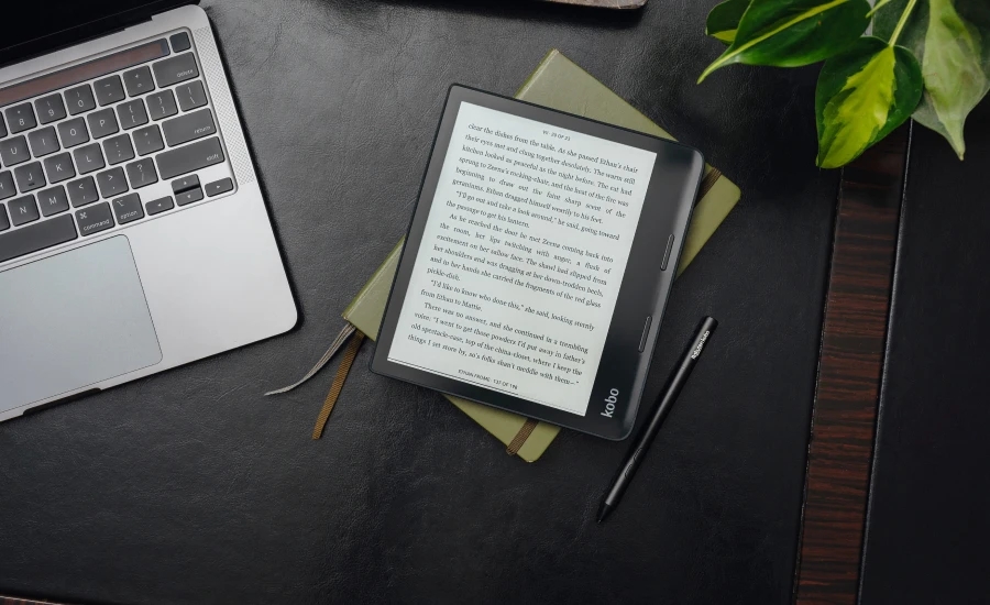
The Sage ereader on a table next to a laptop.

Image Credits: Kobo

Both devices have gotten thicker than their predecessors, presumably to accommodate the new hardware and stylus detection layer. It’s not an improvement, in my opinion, and the devices feel cheaper than the Forma and to a lesser extent the Libra H20. The body feels more like molded plastic than something sculpted, partly because they did away with all the decisive angles and wedges that made the Forma such an interesting shape. The new readers are also heavier than the old ones, which weren’t among the lightest to begin with.

Kobo has never been good at buttons, and these are no exception. The page turn buttons, especially on the Sage, are soft and indecisive and its recessed power button, while an improvement over the Forma’s awful side one, is still not great. The smaller Libra 2 fares better, with clickier but not too clicky buttons.

I’m not a fan of the changes, as you can tell, but it’s not like it ruins the whole thing. But I hope that Kobo reclaims a bit of that premium feel in its next generation, because this has definitely been a step back.

The SleepCover makes it and/or breaks it

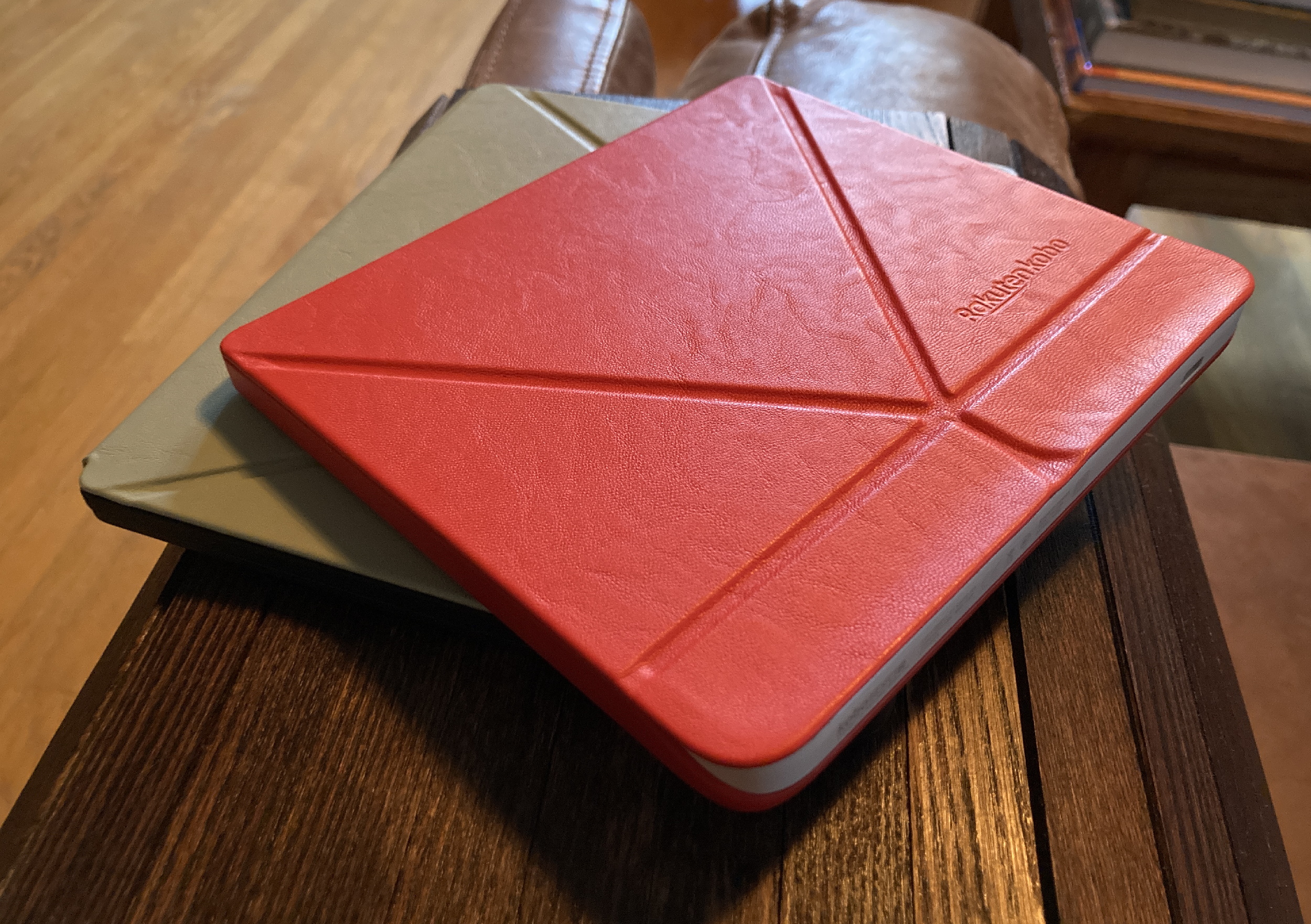
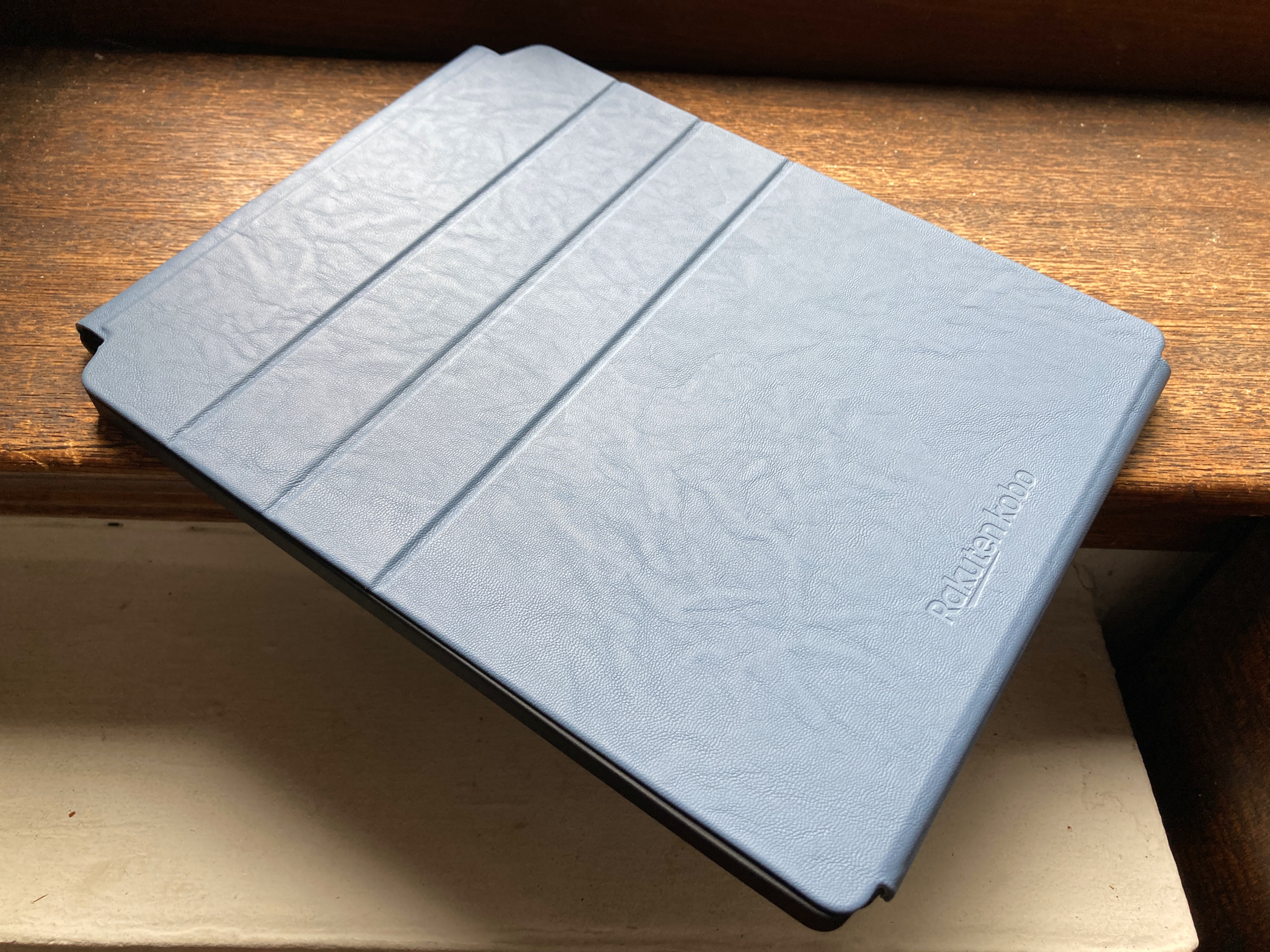
The Kobo ereaders in their sleep cases.

Image Credits: Devin Coldewey / TechCrunch

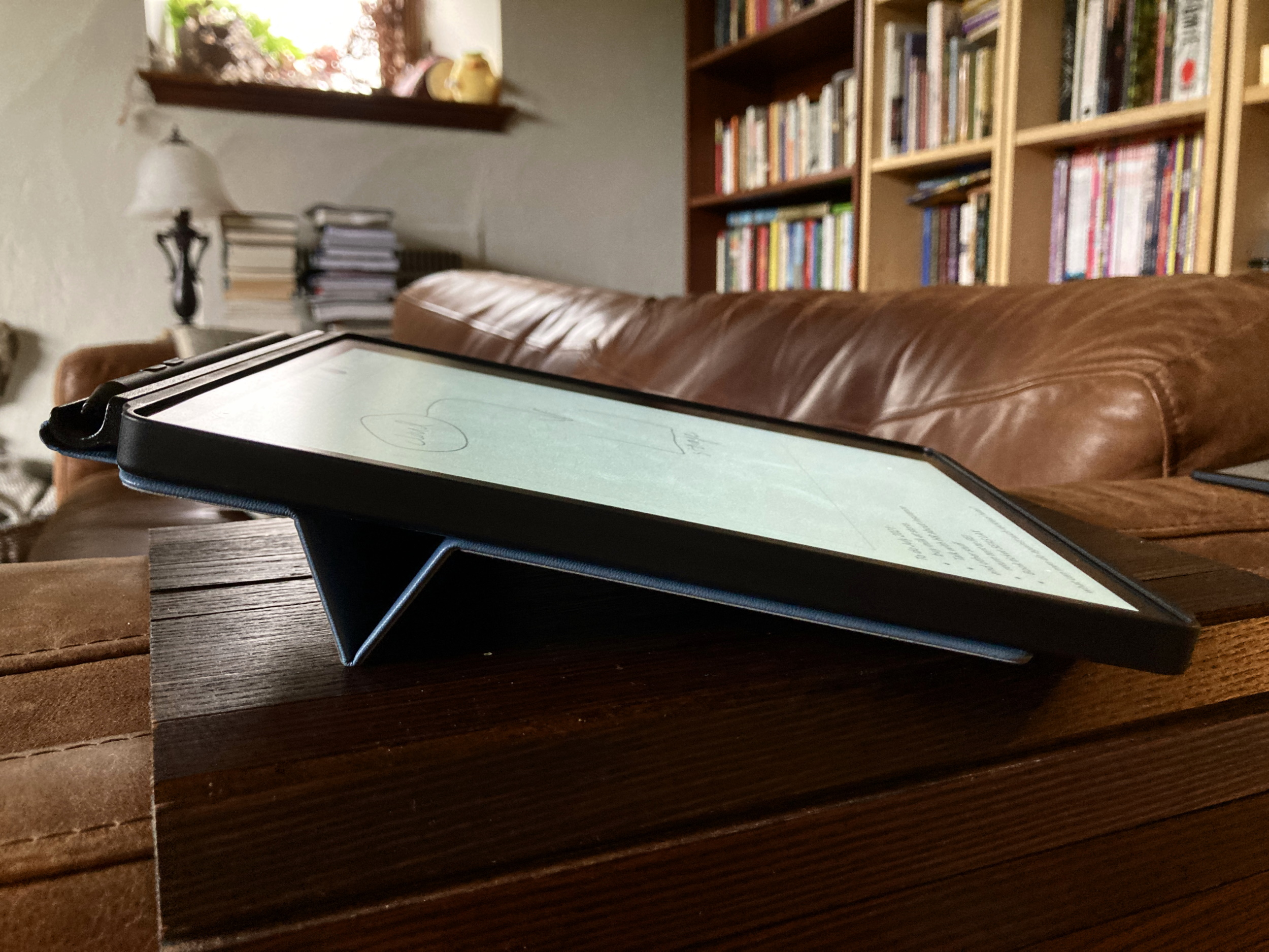
The recommended accessory for both devices is a $40 SleepCover or PowerCover. These leather-esque (not sure if real or fake, but it feels nice) folio covers attach securely and, like others on the market, wake your reader or put it to sleep when you open or close them respectively. These new ones add an origami-like fold system that lets them stand up at an angle.

I prefer my e-readers naked, so I wasn’t expecting to like these — . And on the larger Sage, I didn’t. Already rather large, the Sage with the case becomes even larger with the case, the folding bit seemed too loose, and it covered up the power button — even though it’s kind of superfluous, this bothered me. Yet without it the Sage seemed a bit fragile and lackluster.

On the smaller Libra 2, though, I loved the cover. It turned the somewhat plasticky device into a much more premium-feeling one, and the red color is actually quite attractive (plus the power button is accessible). Not only that but the fold-out piece is great for both setting it down and holding it — gives a bit more shape to it, like folding back the first half of a paperback. And the recessed screen (I prefer a flush one) is protected from grime as well. While I still prefer the Boox’s ultra-compact, ultra-smooth design, the Libra 2 quickly ascended to second place for times when I’m not so worried about the space it takes up.

There are “PowerCovers” for more money, but if your device already lasts weeks, I don’t see the utility in adding more weight and bulk just so you can last a couple more weeks.

My final recommendation here is to skip the Sage and the PowerCovers — if you want big, go big and get an Elipsa or reMarkable. If you want Kobo and you want audiobooks, grab the Libra 2 and a SleepCover, you’ll love it. If you don’t need audiobooks, you can still grab a Forma. All the devices and accessories are available now.

Kobo Elipsa review: A sized-up e-reading companion with clever note taking

Kobo’s Elipsa is the latest in the Amazon rival’s e-reading line, and it’s a big one. The 10.3-inch e-paper display brings it up to iPad dimensions and puts it in direct competition with the reMarkable and Boox’s e-reader tablets. It excels on reading experience, gets by on note-taking and drawing, but falls a bit short on versatility.

Kobo has been creeping upmarket for a few years now, and though the cheaper Clara HD is still the pick of the litter in my opinion, the Forma and Libra H2O are worthy competitors to the Kindle lines. The $400 Elipsa represents a big step up in size, function, and price, and it does justify itself — though there are a few important caveats.

The device is well designed but lacks any flourishes. The tilted “side chin” of the Forma and Libra is flattened out into a simple wide bezel on the right side. The lopsided appearance doesn’t bother me much, and much of the competition has it as well. (Though my favorite is Boox’s ultra-compact, flush-fronted Poke 3)

The 10.3″ screen has a resolution of 1404 x 1872, giving it 227 pixels per inch. That’s well below the 300 PPI of the Clara and Forma, and the typography suffers from noticeably more aliasing if you look closely. Of course, you won’t be looking that closely, since as a larger device you’ll probably be giving the Elipsa a bit more distance and perhaps using a larger type size. I found it perfectly comfortable to read on — 227 PPI isn’t bad, just not the best.

There is a frontlight, which is easily adjustable by sliding your finger up and down the left side of the screen, but unlike other Kobo devices there is no way to change the color temperature. I’ve been spoiled by other devices and now the default cool grey I lived with for years doesn’t feel right, especially with a warmer light shining on your surroundings. The important part is that it is consistent across the full display and adjustable down to a faint glow, something my eyes have thanked me for many times.

Image Credits: Devin Coldewey / TechCrunch

It’s hard to consider the Elipsa independent from the accessories it’s bundled with, and in fact there’s no way to buy one right now without the “sleep cover” and stylus. The truth is they really complete the package, though they do add considerably to its weight and bulk. What when naked is lighter and feels smaller than a standard iPad is heavier and larger once you put its case on and stash the surprisingly weighty stylus at the top.

Image Credits: Devin Coldewey / TechCrunch

The cover is nicely designed, if a bit stiff, and will definitely protect your device from harm. The cover, secured by magnets at the bottom, flips off like a sheet on a legal pad and folds flat behind the device, attaching itself with the same magnets from the other direction. A couple folds in it also stiffen up with further magnetic arrangement into a nice, sturdy little stand. The outside is a grippy faux leather and the inside is soft microfiber.

You can wake and turn off the device by opening and closing the cover, but the whole thing comes with a small catch: you have to have the power button, charging port, and big bezel on the right. When out of its case the Elipsa can, like the others of its lopsided type, be inverted and your content instantly flips. But once you put it in the case, you’re locked in to a semi-right-handed mode. This may or may not bother people but it’s worth mentioning.

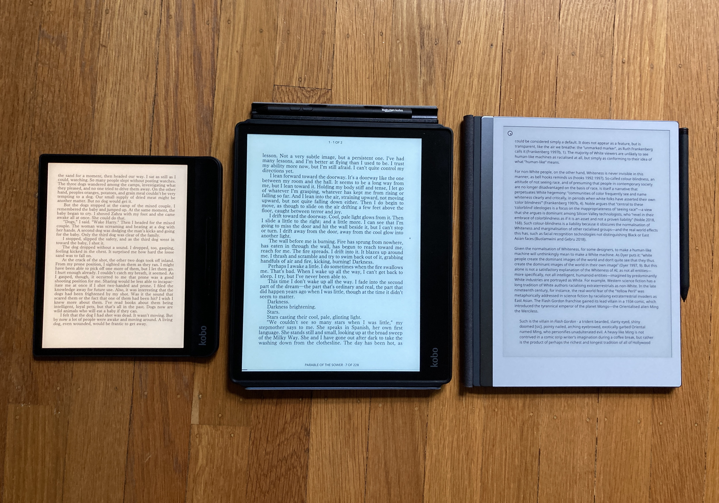
The Elipsa, center, with the Forma and reMarkable 2 to its left and right.

The reading experience is otherwise very similar to that on Kobo’s other devices. A relatively clean interface that surfaces your most recently accessed content and a not overwhelming but still unwelcome amount of promotional stuff (“Find your next great read”). Ebooks free and paid for display well, though it’s never been my preference to read on a large screen like this. I truly wish one of these large e-readers would make a landscape mode with facing pages. Isn’t that more booklike?

Articles from the web, synced via Pocket, look great and are a pleasure to read in this format. It feels more like a magazine page, which is great when you’re reading an online version of one. It’s simply, foolproof and well integrated.

Kobo’s new note-taking prowess

What’s new on the bottom row, though, is “Notebooks,” where unsurprisingly you can create notebooks for scribbling down lists, doodles, notes of course, and generally use the stylus.

The writing experience is adequate. Here I am spoiled by the reMarkable 2, which boasts extremely low lag and high accuracy, as well as much more expression in the line. Kobo doesn’t approach that, and the writing experience is fairly basic, with a noticeable amount of lag, but admirable accuracy.

There are five pen tips, five line widths, and five line shades, and they’re all fine. The stylus has a nice heft to it, though I’d like a grippier material. Two buttons on it let you quickly switch from the current pen style to a highlighter or eraser, where you have stroke-deleting or brush modes. The normal notebooks have the usual gridded, dotted, lined and blank styles, and unlimited pages, but you can’t zoom in or out (not so good for artists).

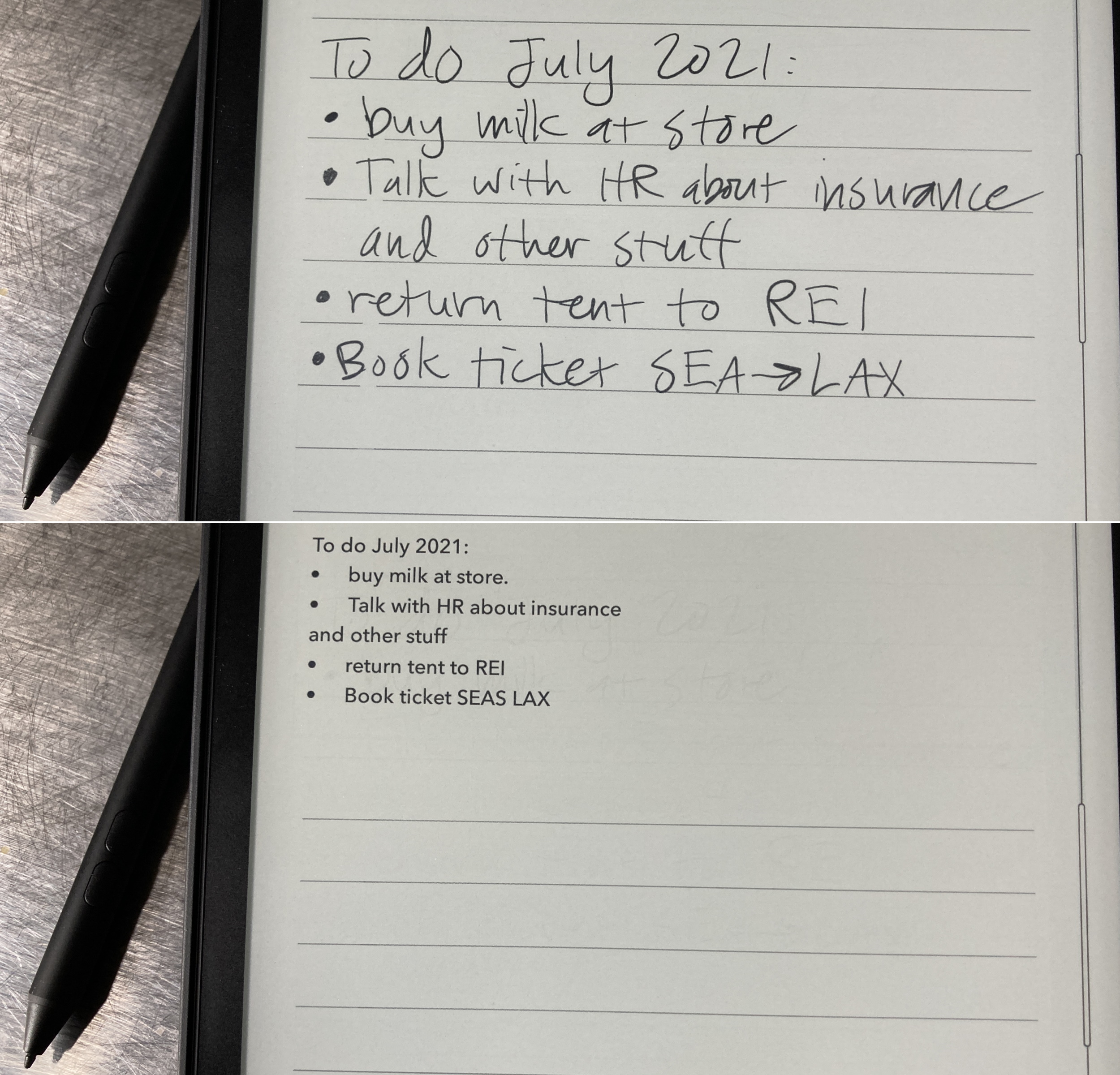
Then there are the “advanced” notebooks, which you must use if you want handwriting recognition and other features. These have indelible lines on which you can write, and a double tap captures your words into type very quickly. You can also put in drawings and equations in their own sections.

Handwriting is shown on the Elipsa tablet before and after conversion to typed text.

Close enough. Image Credits: Devin Coldewey / TechCrunch

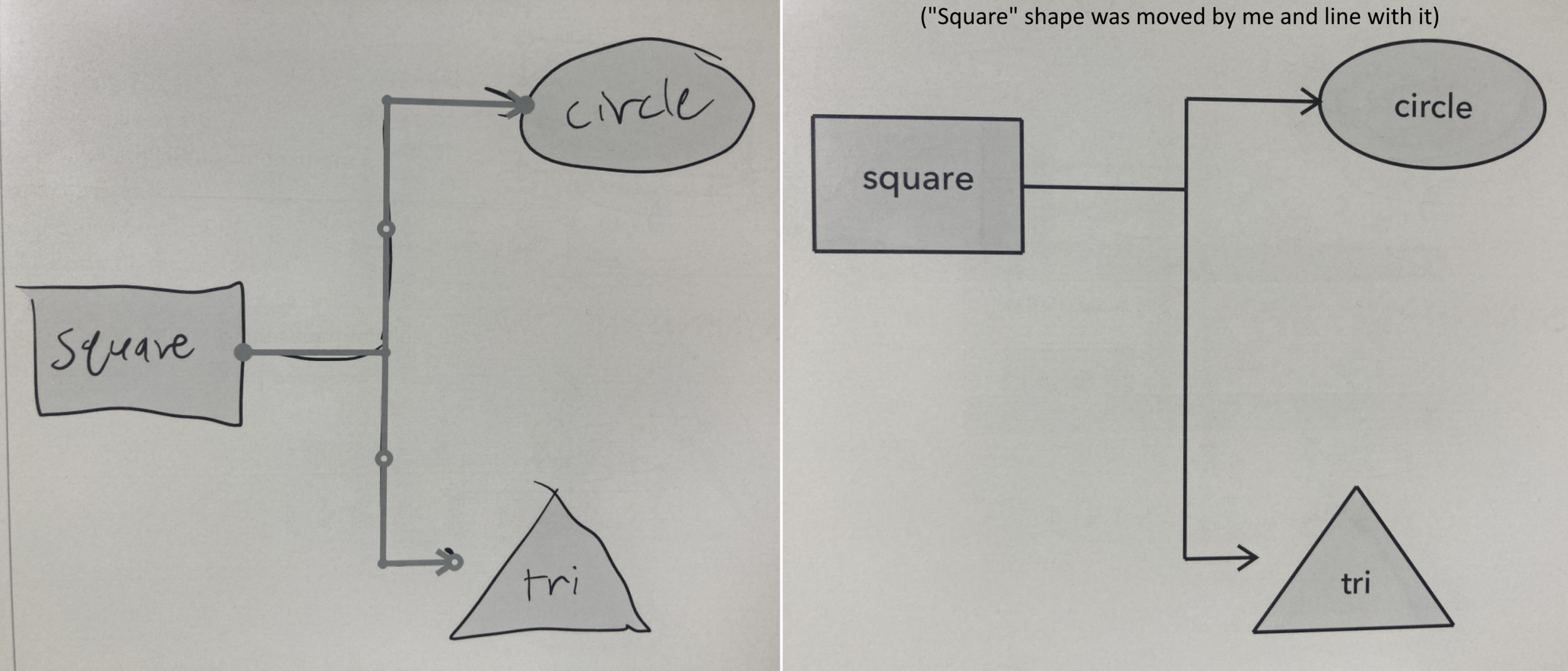
The handwriting recognition is fast and good enough for rough notes, but don’t expect to send these directly to your team without any editing. Likewise the diagram tool that turns gestural sketches of shapes and labels into finalized flowcharts and the like — better than the original wobbly art but still a rough draft. There are a few clever shortcuts and gestures to add or subtract spaces and other common tasks, something you’ll probably get used to fairly quick if you use the Elipsa regularly.

The notebook interface is snappy enough going from page to page or up and down on the “smart” notebooks but nothing like the fluidity of a design program or an art-focused one on an iPad. But it’s also unobtrusive, has good palm blocking, and feels nice in action. The lag on the line is definitely a con, but something you can get used to if you don’t mind the resulting product being a little sloppy.

A sketched diagram is turned into a real one by the Elipsa.

Image Credits: Devin Coldewey / TechCrunch

You can also mark up ebooks, which is nice for highlights but ultimately not that much better than simply selecting the text. And there’s no way you’re writing in the margins with the limitations of this stylus.

Exporting notepads can be done via a linked Dropbox account or over USB connection. Again the reMarkable has a leg up here, for even if its app is a bit restrictive, the live syncing means you don’t ever have to worry about what version of what is where, as long as it’s in the system. On the Kobo it’s more traditional.

Compared to the reMarkable, the Kobo is really just an easier platform for everyday reading, so if you’re looking for a device that focuses on that and has the option of doodling or note-taking on the side, it’s a much better deal. On the other hand, those just looking for an improvement to that stylus-focused tablet should look elsewhere — writing and sketching still feels way better on a reMarkable than almost anything on the market. And compared with something like a Boox tablet, the Elipsa is more simple and focused, but doesn’t allow the opportunity of adding Android apps and games.

At $400 — though this includes a case and stylus — the Elipsa is a considerable investment and comparably priced to an iPad, which is certainly a more versatile device. But I don’t particularly enjoy reading articles or books on my iPad, and the simplicity of an e-reader in general helps me focus when I’m making notes on a paper or something. It’s a different device for a different purpose, but not for everyone.

It is however probably the best way right now to step into the shallow end of the “big e-reader” pool, with more complex or expensive options available should you desire them.

Is your time worth more than $0.30 an hour?

Most of us believe our time is extremely valuable, certainly worth more than thirty cents. But then you read about human decision-making, and you have to wonder what goes through people’s heads.

This time, it is Jeffrey A. Trachtenberg at The Wall Street Journal, who wrote a review of Amazon Publishing, the printing house (if you will) of the ecommerce giant. Amazon published more than one thousand titles in 2017, and now commands roughly a majority of all book purchases made in the U.S., online or offline.

But what really surprised me about the article was this paragraph:

Under the arrangement, these titles are enrolled in Kindle Unlimited, which pays authors based on how many pages of an e-book are read. The payouts are usually around $0.004 to $0.005 a page. Authors would receive $1.20 to $1.50 on 300-page e-book priced at $10, less if readers don’t finish.

If you read an average of say sixty pages an hour, that equates to about thirty cents of royalties per hour of entertainment. Amazon’s revenues are higher given that Kindle Unlimited is a subscription, but still. We can argue that the titles on Kindle Unlimited are pulp fiction, or that the users of Kindle Unlimited lack taste, or whatever.

The reality though is that people (i.e. the reading public) are remarkably parsimonious when it comes to filling up their heads with words. Wired writer Antonio García Martínez tweeted out a question last week:

The obvious answer is that there is literally no market for people to pay $10-20 for 30 pages of content, outside of case studies at Harvard Business School. I chatted with some authors and publishing execs about this, and the answer was two-fold. One is that consumers really have a knack for only paying for thicker books rather than shorter ones. And two, books have enormous fixed costs that make short works infeasible given that consumer market (for instance, the cost of a cover design is the same regardless of length of a book).

And so publishers junk up their books with extras to make them seem thicker than they really are.

Take The Color of Law by Richard Rothstein, which I just finished reading this morning (it’s a fine book). The paperback version is listed on Amazon as “368 pages.” That’s a substantial book! But it isn’t that long at all. The actual core text of the book including the epilogue is 217 pages, with 26 photos strewn about along with fairly heavy amounts of page gaps between chapters. So the core text is maybe around 190 pages. The book then adds a frequently asked questions section (22 pages), an acknowledgements section (12 pages!), notes (40 pages), bibliography (28 pages), an index (18 pages), and a reading group guide (3 pages). 190 pages of 368 is 51.6%.

I am not saying that notes or a bibliography are optional in a political argumentative text, but merely that the publisher, who lists the paperback at $17.95, felt compelled to add all these photos and a FAQ to make the book feel substantial for consumers to get them to pay $18.

In “Brainjunk and the killing of the internet mind,” I argued that we need to start paying more for less in the context of media subscriptions:

It is the deep irony of our times that readers, often deeply educated, will shell out $30 for a meal in New York or San Francisco while paying thousands in rent, only to avoid paying a few bucks a month for a publication, let alone ten. The monthly price for the New York Times is the price of a single cocktail these days in Manhattan.

The bulk of my friends don’t pay for subscriptions. The bulk of the internet doesn’t pay for subscriptions. People will gladly spend hours a day reading brainjunk, to avoid even the slightest expense that might improve the quality of what they are reading. And so, even storied publications are going to fall by the wayside so we can read about “7 Tips on How To Improve Media.”

I think it is well past time to extend that thinking to all forms of content that we consume.

That’s why I have started to calculate the price per page of my books, as a way to adjust for quality and also to match how I value my time. Sitting on my desk right now are three slim books:

  1. Networks of New York by Ingrid Burrington (112 pages, $15.96)
  2. The Lessons of History by Will & Ariel Durant (128 pages, $15.00)
  3. The Emissary by Yoko Tawada (128 pages, $14.95)

There is nothing wrong with paying $18 for a 160 page book. Much like fast food is cheap but perhaps not positively filling, an underpriced book is likely to similarly nourish our brains.

Share your feedback on your startup’s attorney

My colleague Eric Eldon and I are reaching out to startup founders and execs about their experiences with their attorneys. Our goal is to identify the leading lights of the industry and help spark discussions around best practices. If you have an attorney you thought did a fantastic job for your startup, let us know using this short Google Forms survey and also spread the word. We will share the results and more in the coming weeks.

Stray Thoughts (aka, what I am reading)

Short summaries and analysis of important news stories

Media investing is still tough

Nieman Lab interviews Corey Ford, who founded Matter.vc, one of the few venture firms that was willing to invest in media. Ford is taking time away from Matter to consider his next steps after seven years at the helm. Ford on opportunities in investing: “However, I wish that we could have figured out a model that was a mix of companies that are on the venture capital journey — I feel like there’s an opportunity in the middle, in between nonprofits and venture capital. I think especially this space is one where I call it, to use a baseball analogy, instead of looking for only grand slams, what are the good doubles?”

U.S. and China seem to be heading toward a deal

Pressure is growing on both governments to try to calm their trade spat. Meanwhile, in Europe, trade ministers and heads of competition policy are openly debating how best to make Europe competitive with Chinese state-run conglomerates, who are gobbling up market share in strategic industries. Meanwhile, in Huawei news, Oxford University has suspended ties to the embattled company, while Germany considers banning it entirely (which is hard to believe given the number of Huawei ads I saw in Berlin two months ago).

What’s next & obsessions

  • I have a lot of short books on my desk to read.
  • Arman is reading Never Lost Again by Bill Kilday, a history of mapping at Google and beyond.
  • Arman and I are interested in societal resilience startups that are targeting areas like water security, housing, infrastructure, climate change, disaster response, etc. Reach out if you have ideas or companies here <danny@techcrunch.com>