In February 2020, Samsung planted its flag in the sand. Screen issues aside, the original Galaxy Fold was met with a mixed response. “Innovation for innovation’s sake” was a common refrain. The wildly expensive device arrived at just a hair under $2,000. People questioned whether anyone really needed to carry a tablet in their pocket. The device was big and bulky. And then there was the crease.
I won’t go so far as saying the company was definitively proven correct, but in 2023, things are certainly trending that way. According to Counterpoint, foldable shipments grew 64% y-o-y in Q1, hitting 2.5 million. It’s a drop in the bucket versus the overall market, but it’s a positive trend for a category many assumed was dead on arrival. It’s doubly impressive given that — until recently — there simply weren’t many foldables on the market.
Here’s the thing about successfully planting your flag in the sand: The next thing you know, you’re surrounded by everyone else’s flag. Again, I’m not quite ready to declare 2023 the year of the foldable, but it’s certainly the year a lot more companies got into the act. Motorola released a second, Google’s got one, OnePlus is readying its own and its parent company already has a pair, echoing the Samsung’s two form factors.
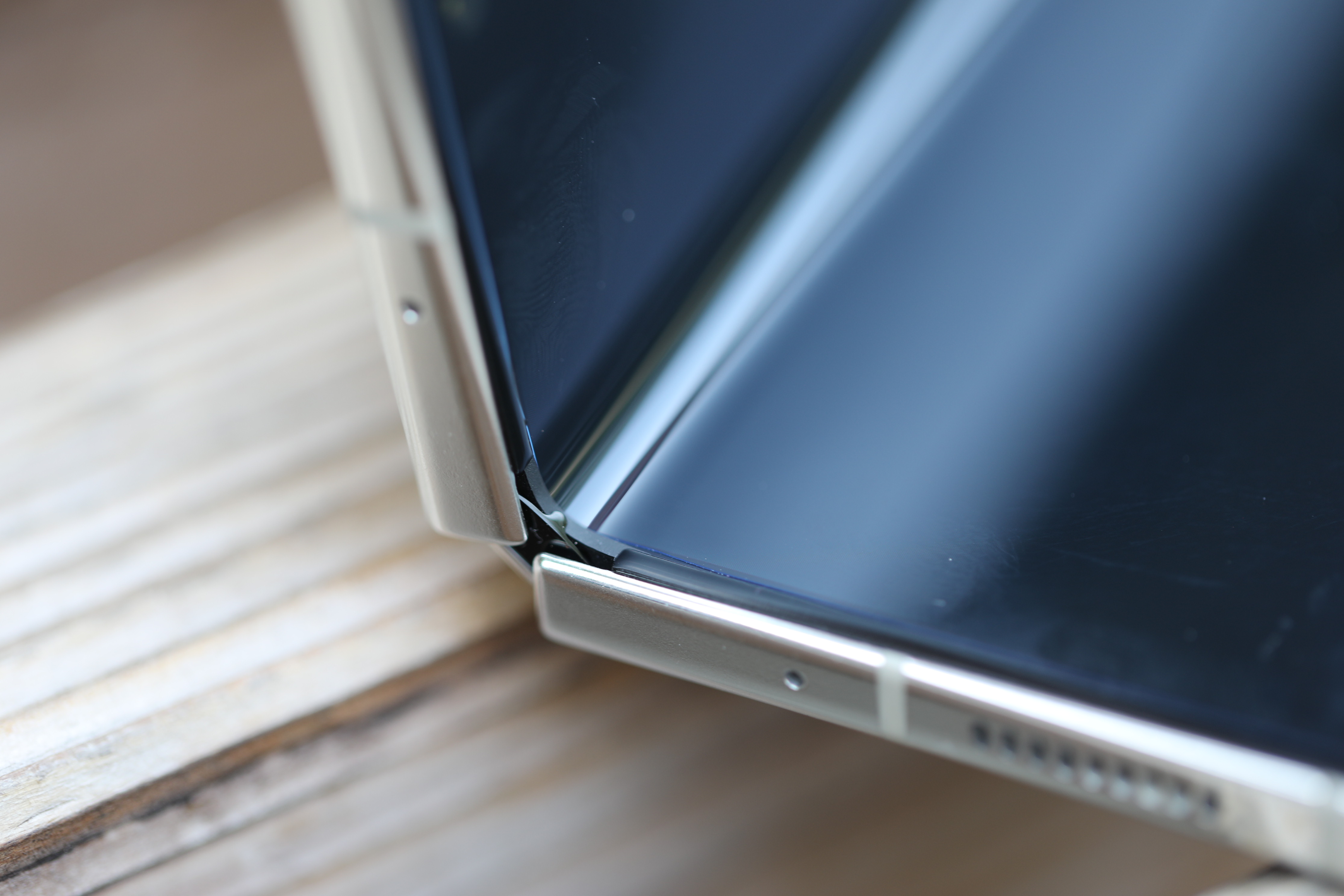
Image Credits: Brian Heater
Heck, even Apple is rumored to be getting into the game in 2024/2025, pending apparent supply chain concerns. The more the category grows, the more competition the Galaxy Z line will face.
China is now the world’s largest foldables market by a sizable distance, courtesy of its own 117% y-o-y growth. Samsung is currently a close third in the country, just behind Huawei and Oppo — of course the former has been struggling on the international stage, courtesy of the trade war. Samsung released the W23 and W23 Flip — variants of the Fold 4 and Flip 4 with a more blinged-out black and gold design — in the country last year and has seen growth as a result.
You only get one chance to make a first impression, as they say. The original Fold undoubtedly made a big one, but even boundary-pushing design is subject to the basic laws of physics. You can’t expect the wheel to be reinvented every year. Some upgrades will be more impactful than others, but on the whole, it’s a game of refinements after you hammer out those initial kinks.
The Fold 5 is one of those iterative devices. It’s a perfectly fine thing for a smartphone to be, but it’s unavoidably made more pronounced amid the rapidly changing category the line helped create. The product’s position in the market means it will invariably be the baseline against which all other foldables are contrast — fairly or unfairly, for better or worse.
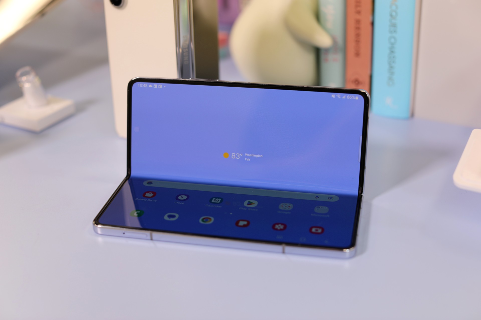
Image Credits: Brian Heater
As personal preferences go, I’ve always found the Fold to be big and bulky. Portability is something I value in foldable design, and this ain’t it. The first Flip spelled out the category’s true potential for me, while this year’s Google Fold delivered something much closer to my platonic industrial design ideal. Each design has its trade-offs, of course — hardware design is a great meditation on compromise. It’s a lesson on prioritizing certain characteristics over others and a tacit understanding that producing things at scale is going to make some people happier than others, while leaving every single one of them at least slightly disappointed.
For the Fold, priority comes in the form of a big screen. It’s the logical extension of the extended project that began with the Galaxy Note in 2011. Much like the Fold, the device had more than its share of detractors. The absurdity of a 5.3-inch screen! This manner of decadence is why Rome fell! Of course, more than a decade ago, that size screen required a much larger phone over all. The device-to-screen ratio improved a great deal over the years, and ultimately the entire Galaxy S line became phablets, making the Note ultimately redundant.
Currently, the largest Galaxy S device is the 6.8-inch Ultra. It’s hard to imagine things expanding too far beyond that in the slate form factor (but listen, I’m a big enough man to admit I’ve been wrong about screen sizes before — me and Steve Jobs have that in common). At a certain point, it’s just too big to carry around.
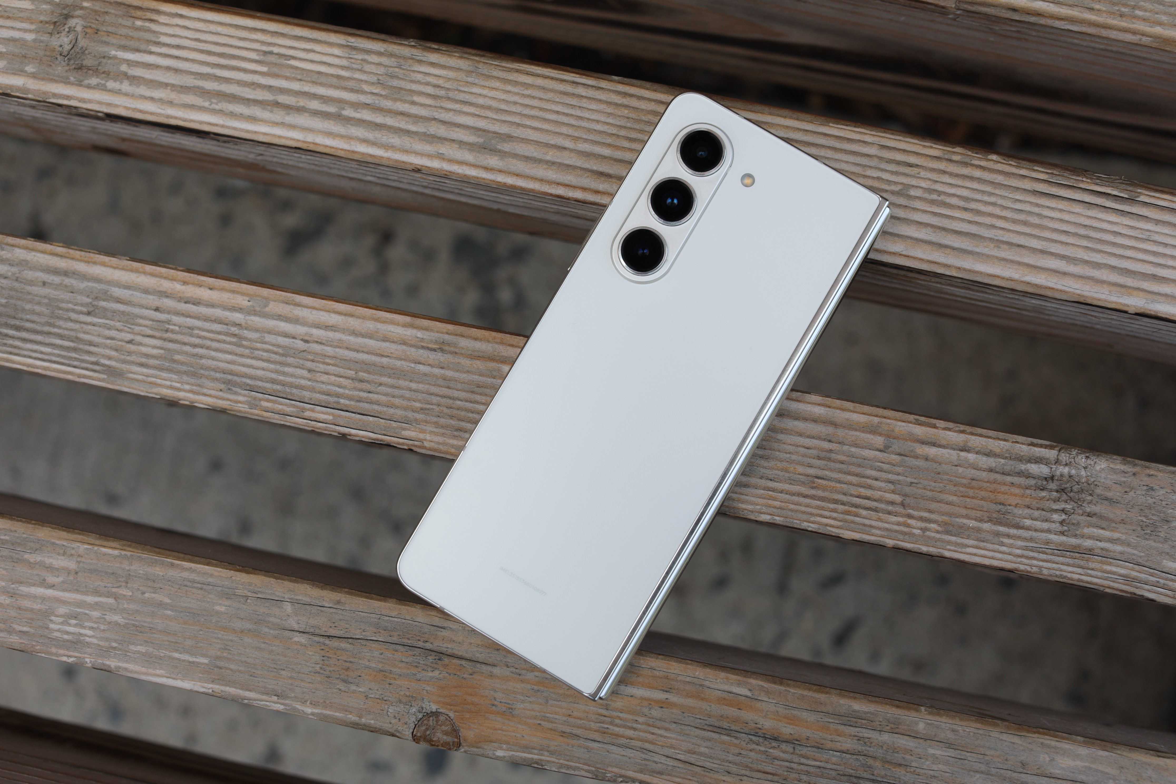
Image Credits: Brian Heater
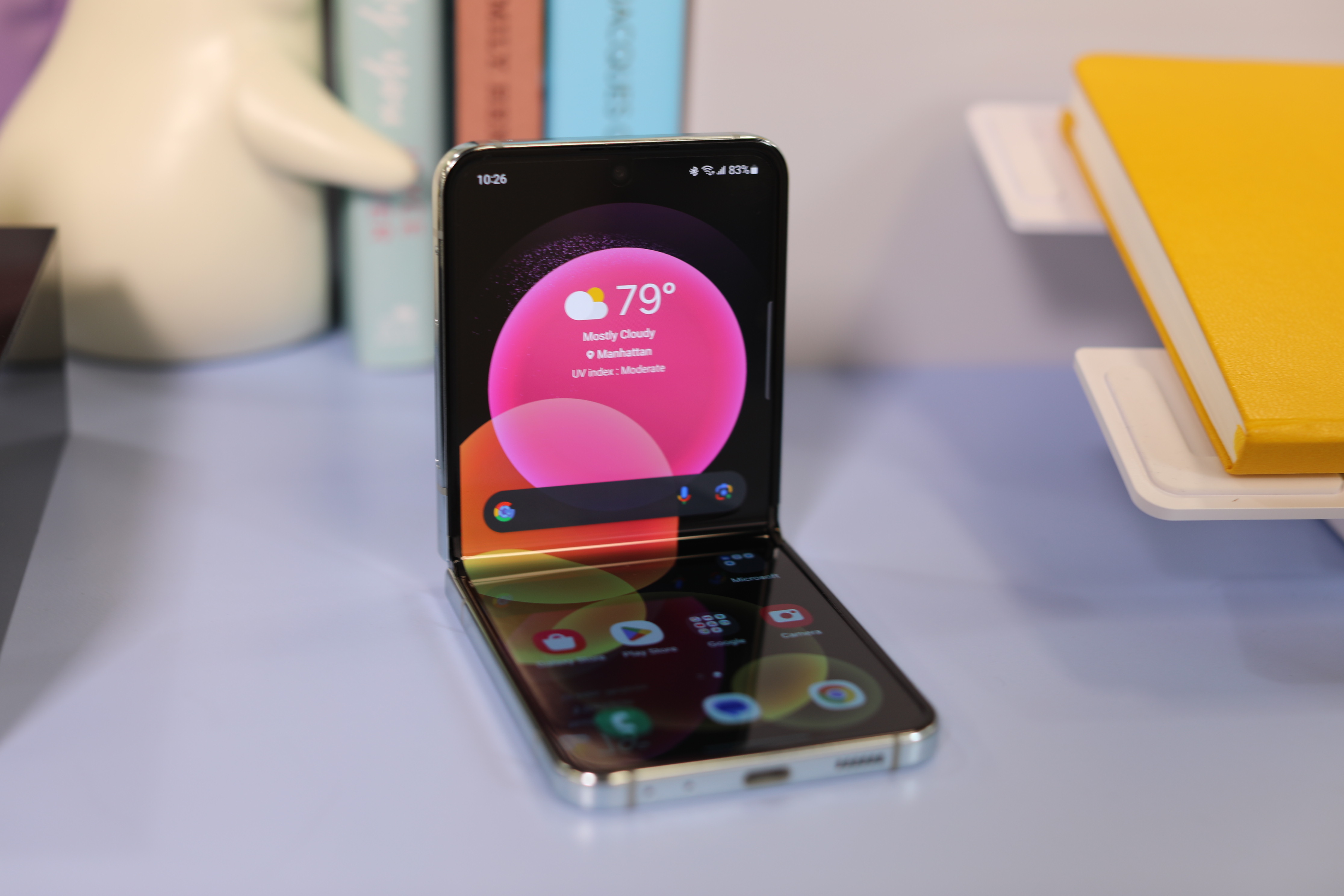
Of course, for many, phones crossed that threshold long ago. The Fold’s appeal, however, is the ability to carry around a 7.6-inch display in your pocket — well into the realm of what we would call a tablet. The displays are effectively unchanged here. The 7.6-inch main screen sports a 2176 x 1812 resolution, while the external is 2316 x 906. Both have an adaptive refresh rate up to 120Hz.
In spite of what some angry people on the internet will likely say in the social media replies to this very story, the appeal is clear. Given the choice between watching a film on a six-inch smartphone and a 7.6-inch, I know what I’m picking every time. Granted, I also have a larger tablet at home, so I don’t find myself in that specific scenario every day.
As for the trade-offs, well, there are a couple. For one thing, the device is narrow. Again, increasing the width of the device would only make it that much larger and heavier. The external screen has, mercifully, expanded over the generations and become that much more useful in the process. It’s not quite edge-to-edge, but it’s getting there. But while 6.2 inches sounds like more than enough screen, the proportions are out of whack — even more so than the Fold’s main display.
At 23.1:9, it’s extremely long and very narrow. There are certain things you can do just fine with that aspect ratio — reading your Bluesky feed for instance. Typing on said Bluesky feed, however, is a different story. I brought the Fold and Flip to a couple of concerts last week for camera-testing purposes. Unfolding a 7.6-inch screen to post on social media is awkward — as is typing on something that big. I gave the external display a shot, and I have to say, every time I review one of these devices, it feels like I’m learning how to type again and suddenly I assume everyone around me is silently judging (truthfully, it’s New York and almost certainly no one cares).
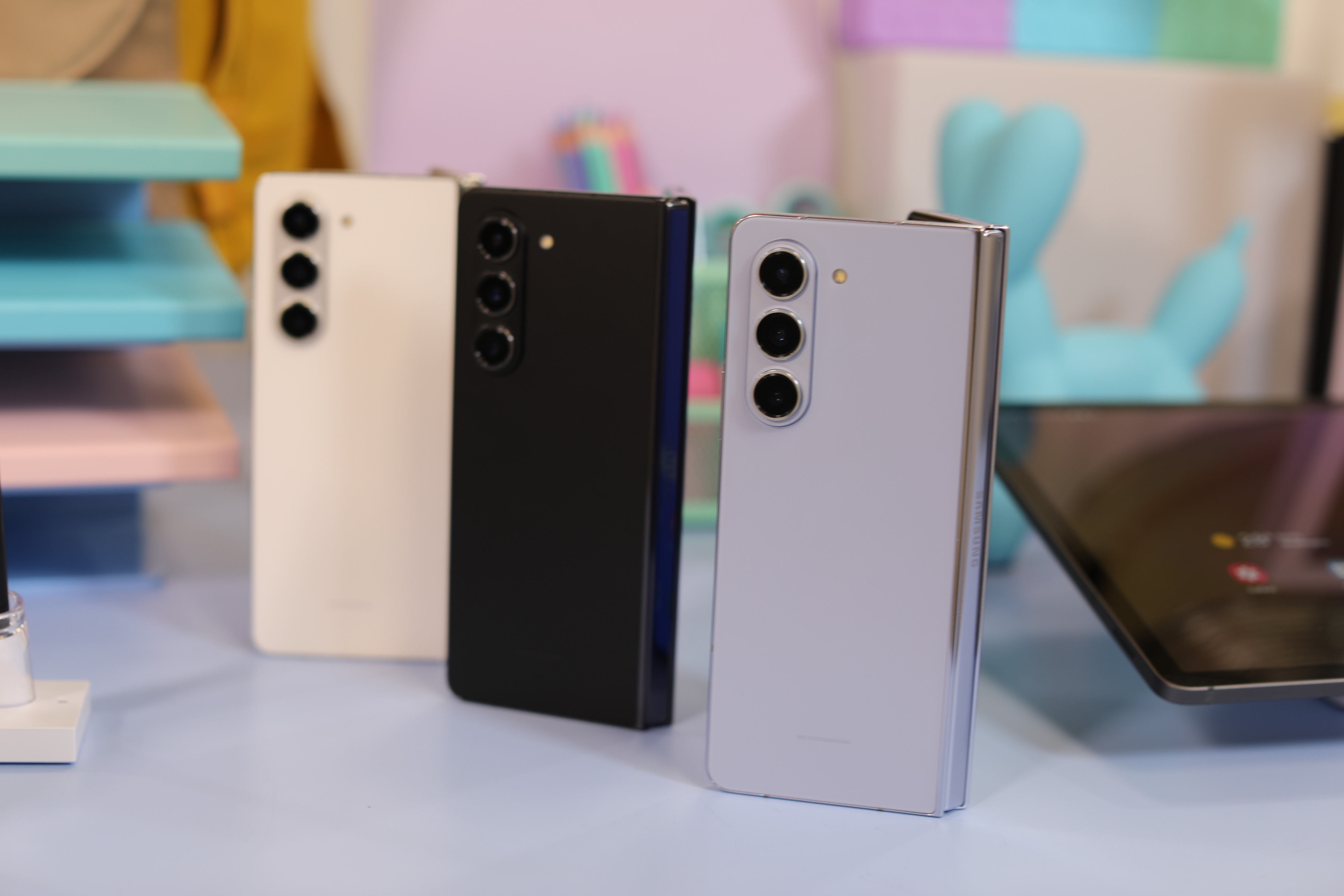
Image Credits: Brian Heater
The other issue with the form factor — as alluded to above — is the sheer size of the device that surrounds it. Again, we’ve got plenty of echoes from the Note’s earliest days. The Fold isn’t my favorite approach to the form factor by any stretch — just one man’s opinion, of course. If foldables were for everyone, we would be in the midst of a very different smartphone market.
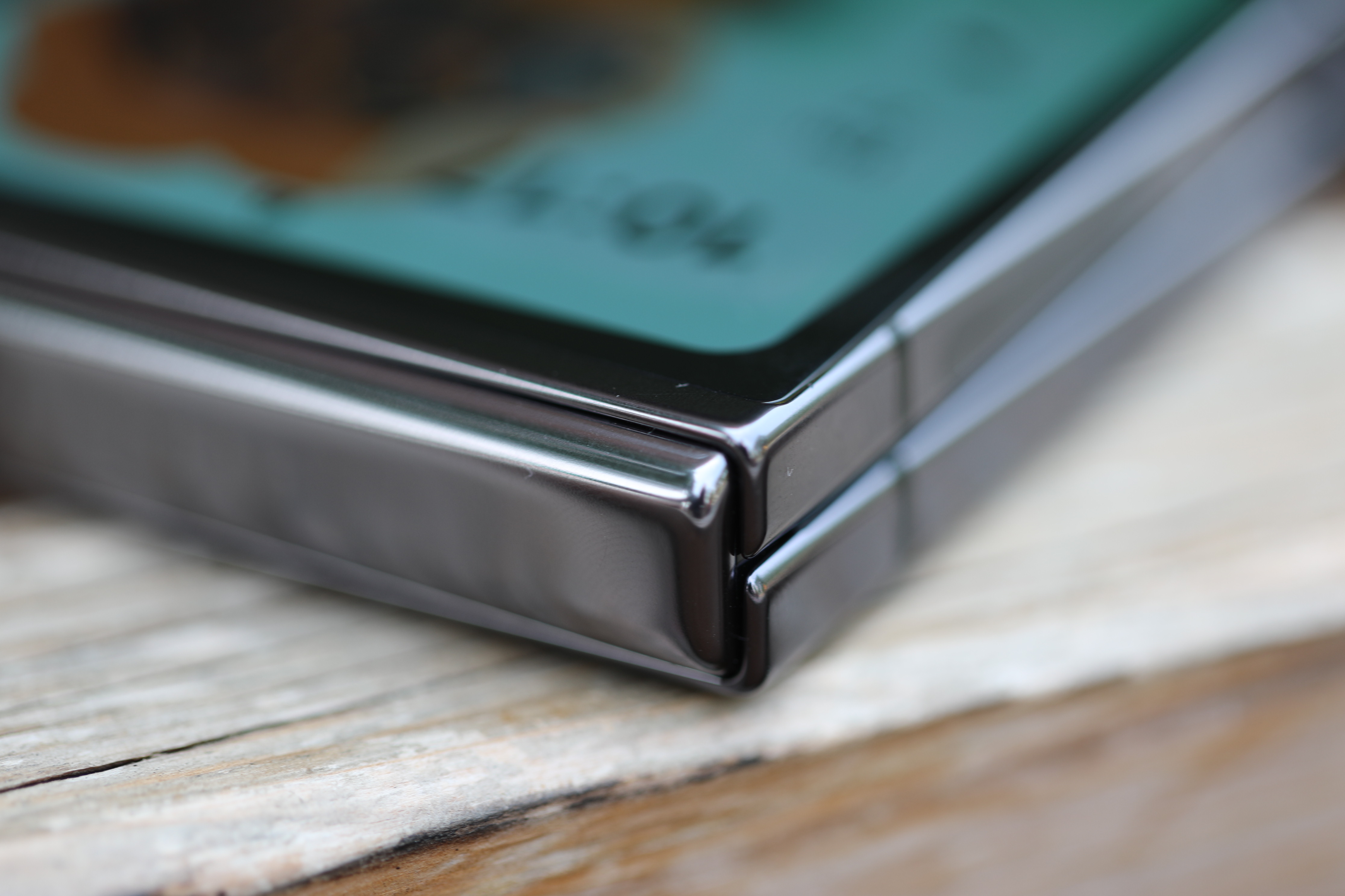
More importantly, the company has found success with the design. Now that it has an alternative in the form of the Flip, it’s hard to imagine Samsung straying very far from the established dimensions. Thankfully, one of the key improvements from the Fold 4 to Fold 5 is a thinner design (again, Note echoes). This was accomplished with what the company calls a Flex Hinge. At 13.4 mm folded and 6.1 unfolded, it’s a noticeable decrease from the Fold 4’s 15.8/6.3mm.
The folded profile is a more significant reduction, because 1) It’s two reduced unfolded profiles stacked atop one another and 2) The gap between them has been observably reduced. The move follows the Pixel Fold launch, which touted its own innovative hinge design as a major selling point, including a barely perceptible gap. At 12.1 mm folded and 5.8 millimeters unfolded, Google still comes out on top.
However, it’s worth pointing out that the gap reduction may have contributed to some of the Fold’s reported screen damage. Quoting myself here:
Some have suggested that the issue is a direct result of having two displays that effectively lie flush, allowing debris to get trapped between and damaging the screen in the process. Given the newer, flatter version of the Galaxy Fold, I asked the company about this potential issue, and they cited the inclusion of bumpers as a protection against this potential issue. As always, the real test comes when the device is launched.
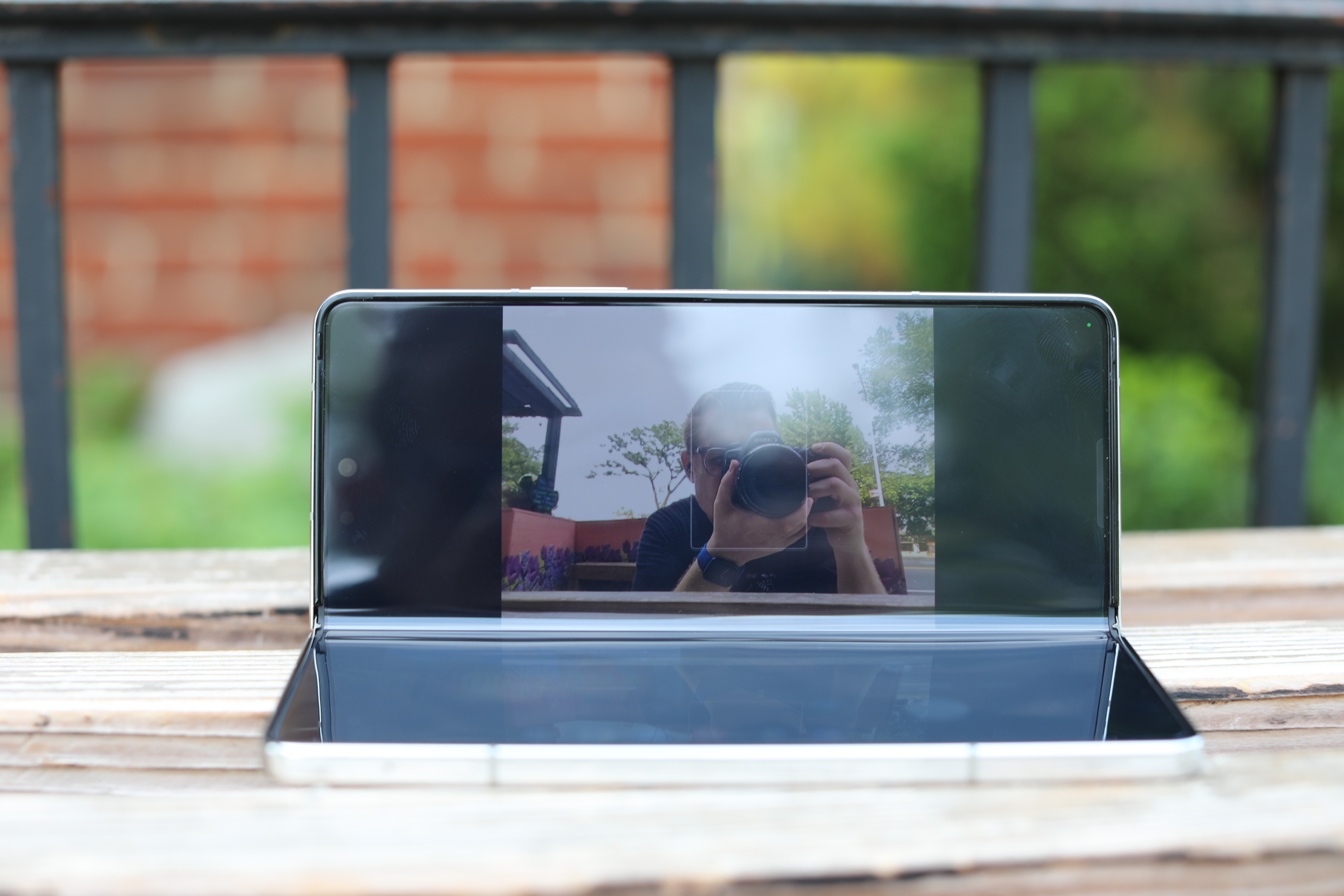
Image Credits: Brian Heater
Something to keep an eye on as more of these are released into the world. When I put the question to Samsung, however, the company noted the inclusion of a bumper around the edge of the device that prohibits the two sides from coming in direct contact with one another.
Along with the thinner design comes a reduction in weight, from 9.28 ounces to 8.92. It’s more than a full ounce lighter than the Pixel Fold, in spite of having the same internal screen size. Beyond the thinner footprint, the biggest update from a hardware perspective is the new(ish) chip. Both the Fold 5 and Flip 5 have been upgraded to the Snapdragon 8 Gen 2 Platform for Galaxy, which debuted back in February with the Galaxy S23. Rumors that the foldables would be among the first to sport a Snapdragon 8+ Gen 2 didn’t pan out — and frankly, it’s not entirely clear whether that chip is going to arrive at all.
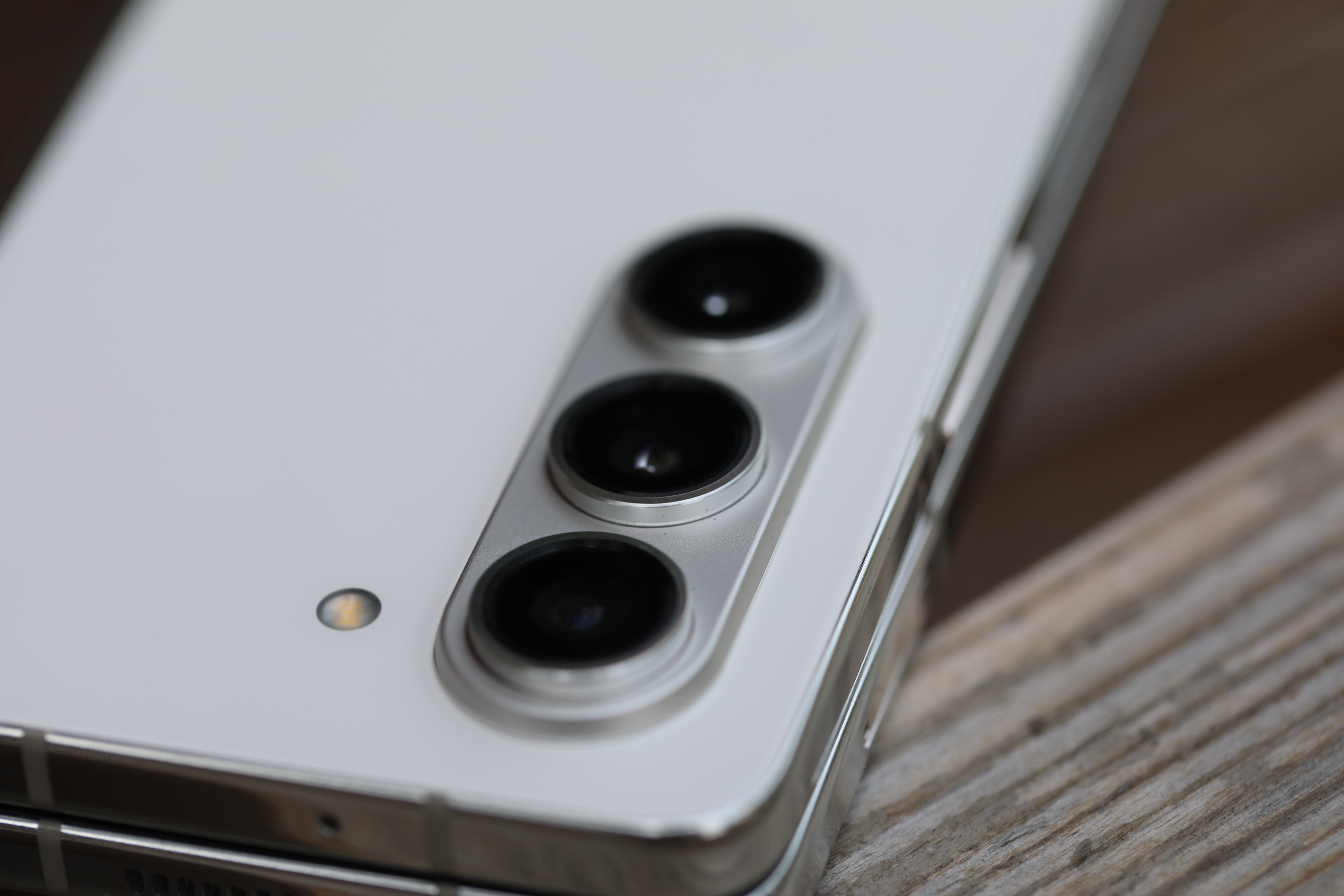
Image Credits: Brian Heater
The Samsung collab brings some slight processing boosts versus the standard 8 Gen 2, but you you’re not likely to see a large difference. What it does deliver however, is arguably just as — or perhaps more — important to users’ day to day. Specifically, it improves battery and camera performance. That’s doubly important, since the hardware for both is, again, functionally the same as the Fold 4.
[gallery ids="2575490,2575499,2575497,2575496,2575495,2575494"]
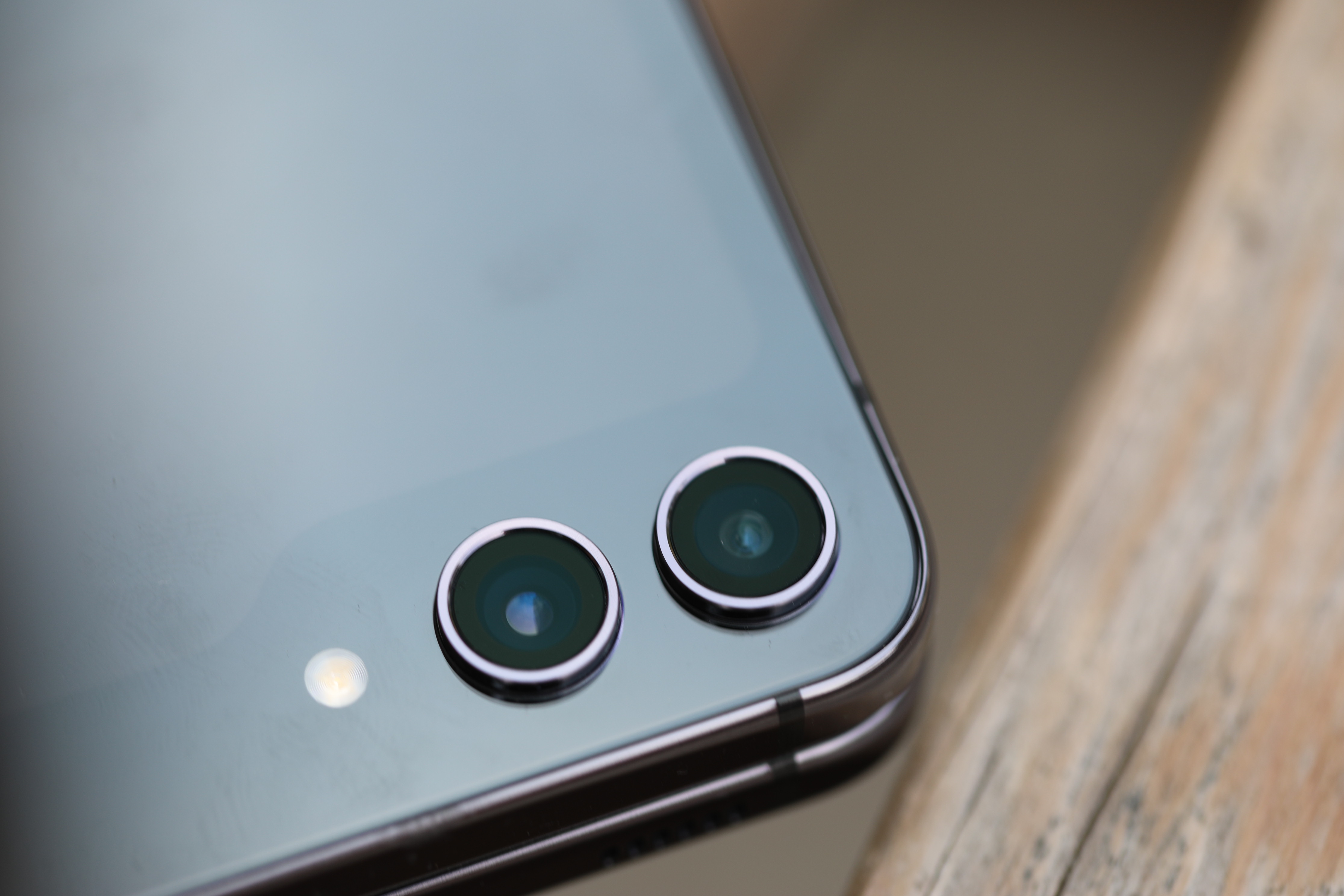
The importance of computational photography only continues to grow in the smartphone world. While the Fold 5 maintains its predecessor’s excellent triple camera system (50-megapixel main, 12-megapixel ultra-wide and 10-megapixel tele with 3x optical zoom), the Snapdragon’s image signal processing continues to improve. The Fold 5’s rear cameras can take some truly excellent photos. Shots captured in full daylight were extremely sharp and vibrant. I would be more than satisfied using the Fold 5 as a primary camera.
[gallery ids="2577339,2577334,2577344,2577335,2577342,2577336,2577343,2577338,2577340,2577341"]
The system struggled a bit when I took it to last week’s Le Tigre and Nuggets anniversary shows, but that’s a lot to throw at a smartphone camera. We’re talking dynamic motions, ever changing and contrasting lights and a good bit of zoom, since I have the tendency to show up around 10 minutes before the bands start. That said, the inclusion of a telephoto (absent on the Flip) makes a big difference; 3x optical isn’t huge, but it goes a long way toward reducing noise and image degradation.
I also have to give a shout-out to portrait mode. The feature still isn’t perfect with uneven edges, but it’s improved a lot over the years. I was hanging on a bench in Astoria Park on Sunday, reading some Cormac McCarthy on the Fold’s Kindle app, when a…let’s say “friendly” squirrel approached (did I mention I was eating a sandwich?). I snapped some shots in Portrait and was really impressed with the results. When I posted a few on social media, a colleague asked whether they had been shot on a phone or SLR. It’s clearer when you take a closer look, but it’s still impressive that the question had to be asked.
[gallery ids="2577325,2577323,2577329,2577328,2577327,2577326,2577324"]
The battery is 4,400mAh (again, like last year). That’s significantly larger than the Fold’s 3,700mAh, but can’t touch the Galaxy S23 Ultra’s 5,000mAh. Once again, we run into a spatial problem here. Specifically, the nature of a foldable requires the battery to be split in two, on either side of the fold. Likely in the not too distant future, we’ll be discussing flexible batteries (Samsung has certainly been filing patents), but we’re not there yet. All that said, The Fold 5 packs more than enough battery life to get you through a full day of use without concern. It ekes out more than both the Fold 4 and Flip 5.
Samsung continues to refine the Fold’s software experience. In fact, the line is blurring a bit between the desktop and mobile here. Again, the device is functionally a tablet when unfolded. The centerpiece of the experience is a desktop-style taskbar that keeps your four most recent apps front and center, for more seamless switching. You can also drag and drop five frequently used apps to stay there all the time. It’s a handy feature. I like it.
Multiwindow functionality works fairly well as a split screen. You can have up to three apps open at once, but more than two can feel like overkill and real estate is still a valuable commodity on a screen this size. There are other tweaks as well, including the ability to drag and drop images between apps.
It’s been fascinating watching companies backward-engineer desktop functionality for mobile devices, and multitasking has definitely come a long way. The Fold is, once again, compatible with the S Pen. There’s no built-in docking slot (a problem of architecture one imagines), though the company does have some nice-looking cases that do the trick.
The Fold format is great for things like teleconferencing in that it effectively serves as its own stand, though the under-display four-megapixel camera leaves a lot to be desired. I fully understand why some many companies are looking for alternatives to the hole-punch camera, but the technology isn’t where it should be on a premium device like this. The display interference makes for shots that look dim and smudged — not the quality you want for what’s ostensibly a business machine.
Shot with the Samsung Galaxy Flip 5. Image Credits: Brian Heater
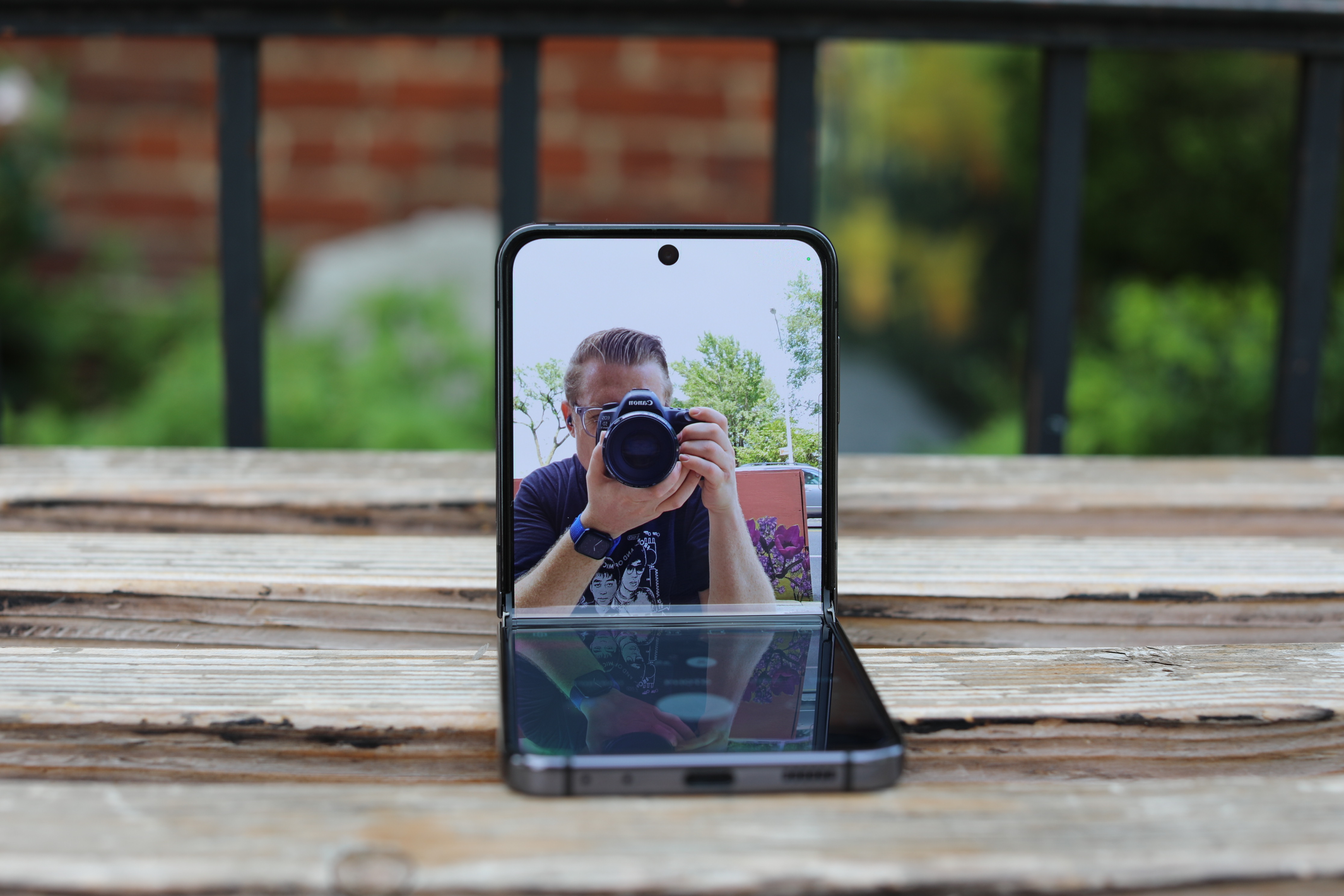
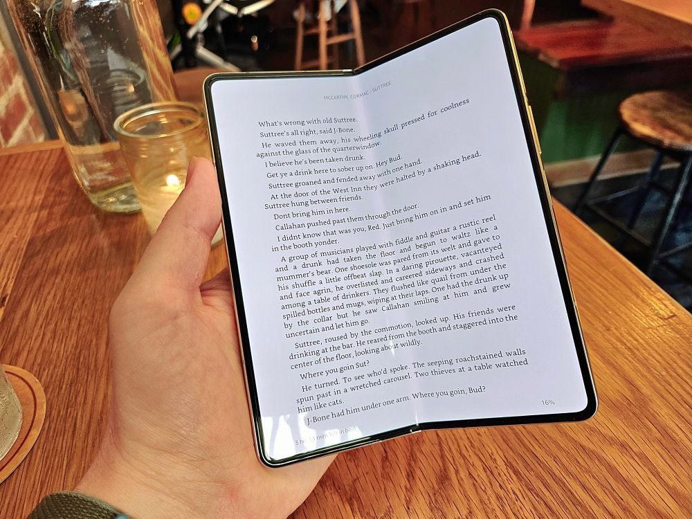
I do, however, appreciate what Samsung calls the “Flex Mode Panel.” It’s the allocation of the bottom screen when the phone is folded at a 90-degree angle and placed in landscape mode. It’s effectively a control panel for features like camera, video/music playback and teleconferencing. I should mention, one application I’ve really grown to appreciate on the form factor is Kindle.
I have a devoted e-reader that I mostly use for travel, but the ability to pull a phone out of your pocket to read a book on a 7.6-inch screen is underappreciated. It’s great for commutes, and the Amazon syncs progress across devices, so you can pick up where you left off. Holding the device open at a slight angle reminiscent of a real book is a nice experience. That said, I’d avoid reading in direct sunlight. That’s where e-readers really shine, so to speak. Sunlight is also a great way to highlight the ever-present crease.
Now we can’t get out of here without talking price. It’s come down a little since the first Fold launched just shy of $2,000. But $1,800 is still prohibitively expensive for a vast majority of consumers — particularly in an era of economic downturns, in which pricing is a major contributor to declining smartphone sales.
Last year, a tear down by Nikkei put the Galaxy Z Fold 4’s component price at an estimated $670. That’s less than 40% of its retail price. Presumably there hasn’t been a huge change for the Fold 5, potentially leaving Samsung with some wiggle room for what it charges (the iPhone, by comparison, is around 46%). Presumably the more of these they sell, the lower the per unit price will become, and if Samsung faces real competition on the international scale, that could potentially impact price.
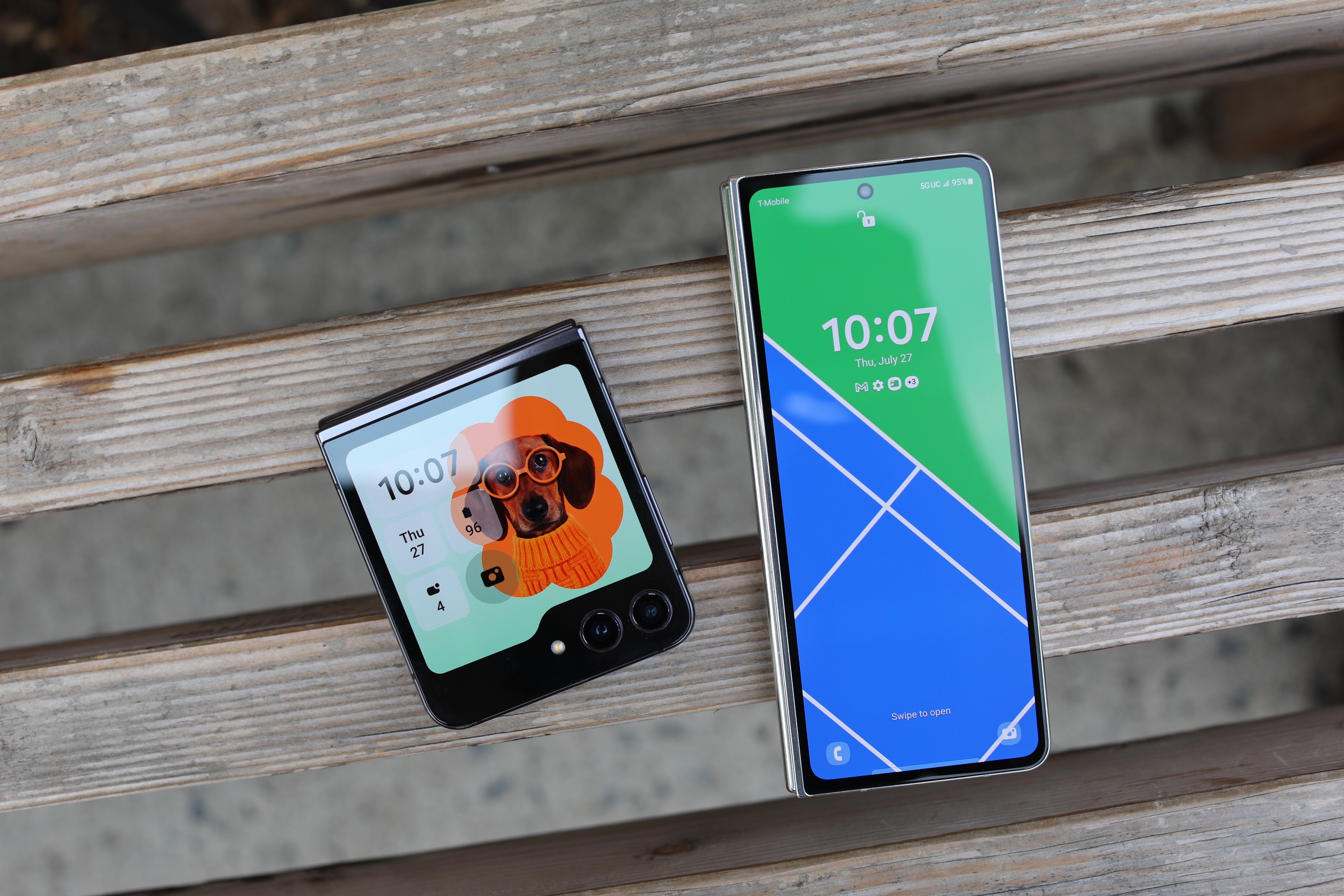
Image Credits: Brian Heater
When I first asked the company about the sales being down between the Fold and Flip, it was implied that the two devices are in an effective dead heat. Upon further questioning, they revealed that the Flip has the advantage — though the company isn’t in the habit of breaking down sales figures. I have to assume, however, that the Flip’s (relatively) reasonable $1,000 price tag is a major contributor.
As a subcategory, foldables have bucked the trend of declining smartphone sales. That’s due in no small part to it being a new form factor, that’s started from a much lower point year-over-year. But it’s an encouraging trend for Samsung and the industry. Given the small list of updates found here, I can’t imagine the Fold 5 winning many converts that the Fold 4 couldn’t. Nor does Samsung offer a super compelling case to upgrade over recent generation Folds.
It’s a slow and steady process, but Samsung’s been at it for a while. Theirs continues to be the most fully realized foldable on the market from a hardware and software perspective. I continue to lean toward the Flip for reasons of personal preferences (ditto the Pixel Fold), but if the Fold is your cup of tea, it continues to be the one to beat.